There’s a specific kind of call that I genuinely look forward to. Not because it’s easy, it’s usually not, but because the problem is so real and so fixable that I’m already mentally sketching solutions before the other person finishes their sentence.
That was the call I had with Katie Rogers.
Katie is the president of CREDN, the Columbia River Eating Disorder Network, a nonprofit based in the Pacific Northwest that connects eating disorder professionals, runs CEs, hosts in-person Lucky Lab networking events, and maintains a provider directory so people can actually find weight-inclusive clinicians in their area. She’s also a private practice dietitian who was running all of this on a volunteer basis! Just running on mission and heart and probably cold coffee.
She found me through Sumner Brooks of EDRD Pro. And honestly? Sumner vouching for someone is basically the gold seal of approval in my world. So I was already paying attention.
The CREDN website wasn’t just in need of a little refresh. It had a structural problem that nobody had caught, or if they had caught it, nobody had fixed it, for what sounds like years.
When a clinician applied for a CREDN membership, they went through a two-step process.
Step one was the application form.
Step two was actually paying.
The idea was that the board would review the application, approve it, and then the applicant would get an email telling them to go pay.
The problem? People were stopping at step one and thinking they were done.
That left a gap in the process where someone could miss out on ever becoming a full member!
I told Katie the same thing I tell most people who come to me with a site that is no longer working for them and is a bit of a hodge podge of things together: starting fresh is almost always going to be faster and cleaner than trying to untangle what’s already there. It’s like trying to brush your teeth while eating an Oreo. You will get nowhere.
She got it immediately.

This is one of my favorite things that happens in a project. A client books one thing and once they see the process, once they’re sitting in a kickoff call watching the mood board take shape and the color palette get refined and the whole thing start to feel cohesive and alive, they realize the bigger picture.
CREDN had a logo and some colors, but they didn’t really have a strategic brand. What they had was a deep purple and some design decisions that had been made by committee over years, without a unifying vision behind any of it. Katie was ready to hold onto the purple as a nod to the organization’s roots, but she was also ready to actually make it look like something.
Abby from their board joined the brand kickoff, and between the two of them, the direction clicked into place fast. We wanted fun but not childlike. Professional but not sterile. Colorful and inclusive without being neon or aggressive.
There was this great moment in the call where Abby said she wanted curves, like, the actual physical curves in the letterforms, because body positivity/neutrality is literally central to what CREDN stands for, and the brand should feel that way too.
We ended up with a palette anchored in smoky purples and lilac, accented with a orange that feels retro without trying too hard, touches of sage green, and just enough warmth in the neutral base to keep it from feeling clinical.
The brand has this mod, almost vintage energy that matched exactly what they were going for: welcoming, weight-inclusive, slightly irreverent, deeply professional.
Katie later told me that adding the full rebrand was a spontaneous decision once she saw how the project was going. That kind of trust doesn’t go unnoticed. I don’t take it lightly when someone hands me their organization’s identity and says, we trust you, go.
This wasn’t a simple five-page brochure site. CREDN needed a whole ecosystem. Let me just walk you through what we were working with.

Multiple tiers: individual professional, student, group practice, and treatment center memberships, each with different pricing and different access levels. The group and treatment center tiers needed to support multiple seats, which meant team management functionality so practice owners could actually see and manage who was on their membership. Critically, the signup form and payment needed to happen in one step, not two. No more forty-five unpaid members.
CREDN’s whole mission includes connecting people to weight-inclusive clinicians, so the directory needed to actually work, real search filters, insurance options in alphabetical order (not a small detail when you’re trying to find Blue Cross vs. Regence vs. BCBS and they’re all technically the same thing), specialization tags including intuitive eating, and location filtering by state.
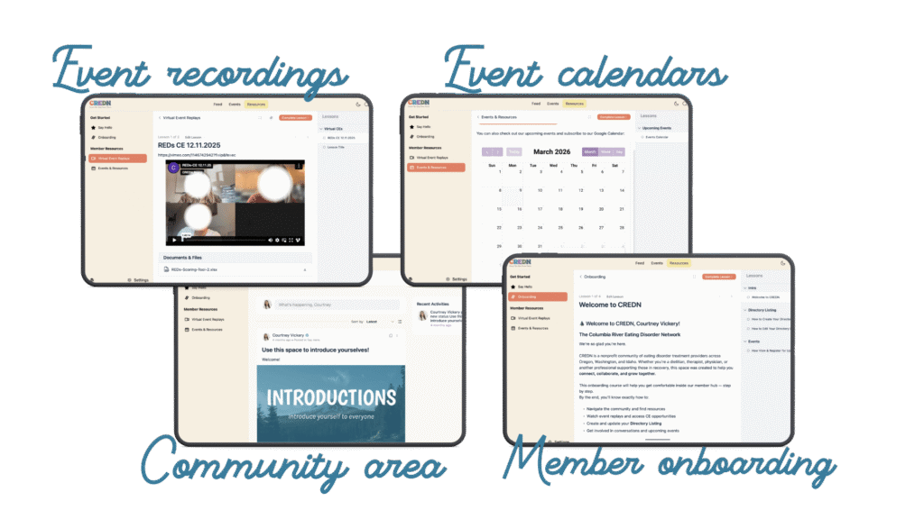
Lucky Labs. Quarterly CEs. The annual conference. Some free, some paid, some members-only, some public. The ability to embed Zoom links, collect RSVPs, and have events show up in a calendar that didn’t require someone to log into the back end every time.
A real one. Not a blank page. Somewhere members could land after logging in and actually see the value they were paying for, their directory listing to edit, upcoming events, recorded CE webinars, a board badge they could download and put on their own websites.
Because the board turns over. Because Katie was running all of this and eventually there would be a new membership chair, and that person deserved documentation and video walkthroughs instead of a panicked Zoom call. We built training videos into the plan from the beginning: how to add an event, how to send an email to all members, how to update the board page, how to handle a member whose payment failed, how to upload a recorded CE. And we are still adding to those training videos as new things are added and changed!
And a public-facing site that actually made someone want to join. The old site had the kind of text-heavy, wall-of-words design that makes your eyes glaze over. The new site is clean, visual, clear about what CREDN is and who it’s for, with testimonials and pricing and a simple path to becoming a member.
Launch day is not the finish line.
I know some people treat it that way but it never has been for me. The finish line is when the thing actually works the way it’s supposed to in the real world, for real users, with real edge cases.
After launch, we kept going.
We wanted to make some adjustment to make things even more streamlined and less admin for the board. So, all 225 active Stripe customers got migrated into FluentCRM with the correct tags, so everyone had the right access and the portal wasn’t locking people out who had every right to be in there. Our amazing developer, Natasha, went through every active member and manually verified access. That kind of thing matters to us at Declet Designs. You don’t migrate 225 people and just hope for the best.
We moved to FluentCart for new member purchases, which gave us a much cleaner purchase flow: someone buys a membership –> they get a welcome email with a password setup link –> they create their password –> they’re automatically logged into the portal –> and all the automation behind the scenes assigns their tags, their role, and their seat limits without anyone having to touch anything manually.
Group and treatment center owners got a dedicated Manage My Team page right in their dashboard. Admins can see seat limits in WP Users. It all just works.
This is what I mean when I say the goal is a system that doesn’t require constant babysitting. Katie and her team are volunteers running a nonprofit. They don’t have time to manually process memberships or dig through Stripe every time someone has a question. The whole point is that the system runs itself so they can focus on the actual mission.
“Declet Designs has been an outstanding company to work with.
I run a non-profit with very specific website needs.
As soon as I met Courtney and the team, they had my immediate trust in the vision. We ended up adding the full rebrand package to our project because of how great they were!
If you are considering switching your web designer, are starting from scratch and need some support as a non-techy person, and need clear instructions with great support, look no further!!”
— Katie Rogers, MS, RD, LD | President, Columbia River Eating Disorder Network

That “immediate trust in the vision” part? That’s what I’m going for every single time.
Not just technically doing the job, but actually getting it. Getting what CREDN does, who their members are, why the directory matters, why the two-step membership process was a disaster, why the brand needed to feel the way it did.
This is what happens when your designer has actually worked in the healthcare field.
I’ve been in the room. I know what it’s like to try to run a professional organization on top of a clinical practice. I get the resource constraints of a nonprofit. And I know that eating disorder clinicians have been burned by designers who nodded along but didn’t actually understand what HAES means or why the word “inclusive” isn’t just decorative copy.
If you are running any kind of membership organization, nonprofit, association, group practice, anything, and your tech is held together with prayers and spreadsheets, I want you to hear this: it doesn’t have to be this way.
The problems CREDN was dealing with weren’t unique. A broken signup flow. A directory that didn’t filter correctly. A member portal that offered no visible value. Board members who had never been properly trained on the back end. These are all fixable!
But they require someone who is going to actually think through the architecture first, not just hand you a pretty homepage and call it done.
The pretty part matters, we spent significant time on the brand because the brand is how people feel about the organization before they ever read a word of copy.
But the backend has to work. The automations have to run. The member experience has to make someone feel like their $80 annual membership is worth it, not make them wonder why they can’t log in.
And if you’re an eating disorder professional, a HAES clinician, or any kind of weight-inclusive provider who has been looking for someone who actually gets your world, hi. That’s what we do here!
Oliver is probably asleep under my desk right now, I’m on my third coffee, and our awesome (and small for a reason) team are ready to dig into your project. Let’s chat about it!

Courtney Vickery, MS, RD, LD is a marketing and wellness strategist with 15+ years of experience in WordPress web design, workflow optimization, and client experience strategy.
She has served in leadership roles as a Director of Corporate Health Services, Group Fitness Program Manager, and Lead Wellness Dietitian, and built her own private practice, Vickery Wellness.
Courtney also has an extensive academic background. At the University of Georgia, she taught undergraduate nutrition courses, served as Interim Director of the Dietetic Internship, and continues to teach as needed.
She is a proud UGA alum, holding:
MS/DI in Foods & Nutrition
BS in Dietetics
BA in Political Science
With her unique blend of academic expertise, leadership experience, and design-driven strategy, Courtney helps professionals and organizations improve their systems, websites, and client experiences with clarity and confidence.


COPYRIGHT 2026 DECLET DESIGNS LLC