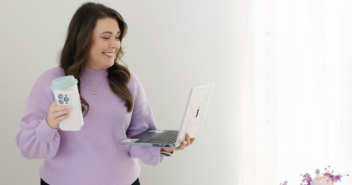
A behind-the-scenes look at transforming a therapy and nutrition practice’s brand identity from “just like everyone else’s website” to a calming digital sanctuary that perfectly captures their healing mission.
Picture this: You’ve built a successful eating disorder therapy and nutrition practice. Your clients love working with you. Your referrals are steady. But every time you look at your website, something feels… off.
This was exactly where Megan, founder of A Soft Place to Land LLC, found herself when she reached out to me. Despite having a functional website that technically worked, she couldn’t shake the feeling that it looked “like everyone else’s website” and didn’t truly represent the safe, nurturing space she’d created for her clients.
“I don’t want it to look like everyone else’s website,” Megan shared during our initial consultation. This sentiment is more common than you might think—many business owners find themselves with websites that work but don’t feel right.
Before diving into colors, fonts, or layouts, I knew we needed to understand what A Soft Place to Land truly represented. Through a series of brand discovery questions and a full brand strategy session, we uncovered the essence of Megan’s practice:
When I asked Megan what animal would represent her brand, her answer was immediate: “A golden retriever. Like, reliable and… what you see is what you get.” This wasn’t just about being friendly—it was about embodying trustworthiness in its purest form. Golden retrievers are inherently safe, approachable, and nurturing without being overwhelming.
“Fall, because it feels cozy,” Megan said when I asked about her brand’s season. But as we talked more, we realized it was actually winter that captured her vision—not the harsh, cold version, but the cozy, nurturing side. Think soft blankets, warm tea, and that peaceful feeling of being safely inside while snow falls gently outside.

Her brand’s song? “Acoustic guitar with no words in it, or, like, very, like, light piano music.” Nothing jarring, nothing demanding attention—just gentle, ambient comfort that allows space for healing and reflection.
One of Megan’s biggest pain points was her existing color palette. “I don’t like the salmon,” she admitted, referring to the peachy-orange accent color that was on her current site. This wasn’t just a personal preference—it was a fundamental misalignment with her brand’s energy.
“I don’t think I like warm colors. I like the cool. I love white. I love, like, airy, but not, like a beachy airy,” Megan explained. This distinction was crucial. She wanted the freshness and openness of cool tones without the vacation-y, tropical associations that might feel too casual for therapy work.
To understand Megan’s visual language, we explored her Pinterest boards together. What we found was telling—while her official “brand board” leaned warm with purples and blush tones, her interior design inspirations told a different story entirely.
Her true aesthetic emerged in images of:
“I actually love this better than what I have now,” she said, referring to her previous website that featured a clean navy, light blue, and white color scheme. This was our eureka moment—her authentic brand voice had been there all along.
Through our discovery process, we identified Megan’s core brand attributes:
What A Soft Place to Land IS:
What it’s NOT:
This clarity became our north star for every design decision that followed.
Understanding brand alignment meant identifying what other businesses shared A Soft Place to Land’s values and aesthetic. Megan immediately thought of “any type of coffee shops. Like, really relaxed coffee shops. There’s a coffee shop near me called Plants and Coffee, and they sell plants and coffee. And it’s just like, you sit and there are just the most comfortable couches.”
This perfectly captured the vibe we were after—the kind of place where you want to stay, where comfort is prioritized over flashiness, and where the environment itself communicates care and safety.
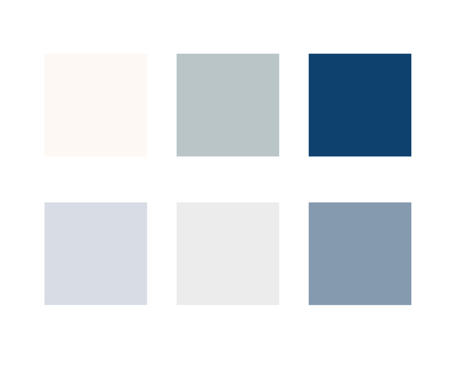
Armed with insights from our brand discovery, we began crafting a color palette that truly reflected A Soft Place to Land’s essence. Using Megan’s Pinterest board as inspiration, I pulled colors directly from her saved images to create a cohesive palette.
Primary Colors:
Accent Colors:
“Oh, my God. So good. Incredible… that feels so much better,” was Megan’s immediate reaction when she saw the new palette in action on a mockup. The transformation was dramatic—suddenly, her brand felt like her.
One of the most important questions we explored was: “When people interact with your brand and when they come to your website, what do you want them to feel?”
Megan’s answer was profound: “I want it to feel like they’re like. Oh. Like they can feel like their nervous system is relaxing. Like, they can sense that this is, like, a trustworthy, like, safe space that they can show up and there’s no expectations.”
This became our design mission: creating a digital space that could actually help calm visitors’ nervous systems—no small feat for a website.
While Megan was currently using Poppins, we discussed alternatives that could better reflect her brand personality.
The goal was finding fonts that felt:
For the upcoming team photoshoot, we recommended:
Our brand work revealed some technical challenges that needed addressing:
Megan’s current site was built on Wix, which presented several limitations:
When we analyzed her current site performance, we discovered:
These technical issues meant that even with a perfect brand and beautiful design, potential clients weren’t finding her online.
Based on our brand discovery and Megan’s business goals, we mapped out an improved site structure:
Core Pages:
This structure allows for better SEO targeting while serving different audience segments effectively.

The impact of thorough brand discovery became clear in Megan’s feedback about our process:
“Courtney is the Beyonce/TSwift of web design and such a wonderful human to work with! I was blown away at the finished product and I loved how detail oriented Courtney was! The entire process exceeded my expectations! I was surprised and impressed with how many questions I had to fill out before the two week design period started- I’ve never had a web designer take that much time to invest in my practice.”
This testimonial highlights something crucial: the value of taking time upfront to really understand a brand before jumping into design. Too many web projects fail because they skip this foundational work.
Megan’s transformation illustrates a critical point for mental health professionals: your online presence isn’t just marketing—it’s an extension of your therapeutic space. When your website truly reflects your values and approach, it begins the healing process before clients even book their first session.
For eating disorder treatment specifically, trust is paramount. Clients need to sense safety and authenticity from the very first interaction. When Megan’s brand colors shifted from the jarring salmon to calming blues and greens, it wasn’t just aesthetic—it was therapeutic.
Megan’s goal of helping visitors’ nervous systems relax through her website touches on something profound about trauma-informed design. Colors, fonts, spacing, and imagery all contribute to how safe a space feels, even digitally.
Moving forward, Megan’s brand transformation would include:
Megan’s journey offers valuable insights for other therapy and nutrition practice owners:
If your website doesn’t feel right, it probably isn’t right—even if others tell you it looks fine.
Brand work isn’t about pretty colors; it’s about accurately representing your values and approach.
Every design choice should support your therapeutic goals and client comfort.
Thorough brand discovery prevents expensive redesigns later and ensures authentic results.
Beautiful branding means nothing if potential clients can’t find you online.
With her new brand direction established, Megan is positioned to create a digital presence that truly serves both her business goals and her clients’ needs. The shift from orange accents to a carefully crafted cool-toned palette represents more than a design change—it’s a return to authenticity.
Her practice’s mission of providing “a space that feels like no topics are off limits… a space to test the waters of vulnerability” will now be supported by a visual identity that communicates safety from the first click.
When therapy and nutrition practices invest in authentic branding, the impact extends far beyond their own business. Megan’s work with eating disorder recovery requires enormous trust and vulnerability from clients. By creating a digital space that truly reflects her values and approach, she’s not just building a business—she’s creating a bridge to healing for people who desperately need it.
The transformation from “just another website” to a digital sanctuary shows what’s possible when we take the time to understand not just what looks good, but what feels right. In the end, that’s what authentic branding is all about: creating a genuine connection between who you are and how you show up in the world.
Ready to improve your own practice’s brand? Learn more about our strategic approach to website design and branding for mental health professionals at decletdesigns.com.

Courtney Vickery, MS, RD, LD is a marketing and wellness strategist with 15+ years of experience in WordPress web design, workflow optimization, and client experience strategy.
She has served in leadership roles as a Director of Corporate Health Services, Group Fitness Program Manager, and Lead Wellness Dietitian, and built her own private practice, Vickery Wellness.
Courtney also has an extensive academic background. At the University of Georgia, she taught undergraduate nutrition courses, served as Interim Director of the Dietetic Internship, and continues to teach as needed.
She is a proud UGA alum, holding:
MS/DI in Foods & Nutrition
BS in Dietetics
BA in Political Science
With her unique blend of academic expertise, leadership experience, and design-driven strategy, Courtney helps professionals and organizations improve their systems, websites, and client experiences with clarity and confidence.


COPYRIGHT 2026 DECLET DESIGNS LLC