Grab your green smoothies and settle in, because I’ve got a story that’ll knock your compression socks off. It’s about how we took Shay Tinari’s nutrition website from “meh” to “mind-blowing,” if I do say so myself.
Shay Tinari, who is a total boss in the world of weight-inclusive nutrition counseling, helps people break free from diet culture and embrace a healthier relationship with food. She’s got the skills, the passion, AND a vision. But there’s just one tiny problem – her website looked like it was designed by a toddler hopped up on pixie sticks. (No offense to toddlers or pixie sticks… or Shay of course!)
That’s where yours truly came in, ready to work some digital magic and turn this online presence from drab to fab. Spoiler alert: the results are so good, they might just make you want to hug your computer. (Don’t actually do that. Computers don’t like hugs. Trust me on this one.)
When Shay first reached out, she was growing her virtual practice. Like many of my clients, Shay is all about that weight-inclusive approach, helping folks recover from disordered eating and build a relationship with food that doesn’t involve guilt, shame, or wondering if celery actually has negative calories. (Spoiler: it doesn’t. That’s not how calories work, people.)
Shay needed a brand and website that could keep up with her awesomeness. She wanted something that screamed “compassion” and “commitment” louder than my kids screaming for ice cream on a hot summer day. The challenge was clear: create a website that’s not just a pretty face, but a powerful tool for connecting with potential clients and growing her practice.

We’re talking a site that’s easy to navigate, mobile-responsive (because let’s face it, we all doom-scroll in bed), and optimized for search engines. The goal? Attract, engage, and convert visitors into clients faster than you can say “avocado toast.”
To bring Shay’s digital dreams to life, we decided on a custom WordPress website. Why WordPress, you ask? Well, it’s like the Swiss Army knife of the internet – versatile, reliable, and it can open a bottle of wine in a pinch. (Okay, maybe not that last part, but wouldn’t that be cool?)

Here’s how we turned Shay’s website from zero to hero:
First things first, we needed to give this site some serious structure. We organized everything into key sections: Home, About, Services, Blog, and Contact. It’s like Marie Kondo came in and tidied up the whole dang internet.
We went full SEO ninja on this bad boy. We’re talking keyword optimization that would make Google blush. “Weight-inclusive nutrition counseling”? Check. “Intuitive eating”? Double-check. By the time we were done, this site was more discoverable than that embarrassing photo of you from junior high. (You know the one.)
Now, let’s talk design. Shay’s brand is about creating a safe space for her clients, kind of like how my couch is a safe space for me when I’m avoiding adulting. We went for a clean, neutral palette with pops of teal and green, topped off with a warm yellow that’s cozier than my cat, Finnick, curled up in a sunbeam.
The whole vibe? Scandinavian-inspired. Simplicity, functionality, and a connection to nature that’ll make you want to hug a tree. (Again, don’t actually do that. Trees have boundaries too.)
We threw in some light, airy photography with botanical elements, because nothing says “health and wellness” like a well-placed fern. Add in some rounded corners and modern sans serif fonts, and boom – you’ve got a website that’s more soothing than a warm bath after a long day of dealing with, well, people.
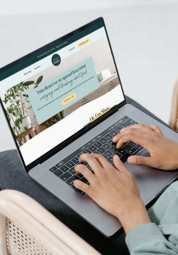
The Services page is where the magic happens. We laid out all the ways Shay can support her clients on their journey to food freedom. Each service is described in detail, focusing on how Shay’s expertise can help folks overcome disordered eating and improve their relationship with food.
We also included clear call-to-action buttons and a simple contact form. It’s so easy to get in touch with Shay, you might accidentally book a session while scrolling through Instagram. (Okay, not really, but you get the idea.)
Shay’s blog is where she really gets to show off her nutrition knowledge. We set her up with a platform to share her knowledge on everything from intuitive eating to mental health.
Each blog post is SEO-friendly and shareable, making it easier for Shay to spread her message of food freedom far and wide.
If your website isn’t mobile-responsive, you might as well be using smoke signals to communicate. We made sure Shay’s site looks gorgeous whether you’re browsing on a desktop, phone, or one of those smart fridges that judges your late-night snack choices.
This mobile-friendly approach is crucial for reaching Shay’s audience, who might be accessing the site while waiting in line for their morning coffee or hiding in the bathroom to avoid social interactions. (We’ve all been there.)
Alright, drumroll please… It’s time for the moment of truth. The results of Shay’s website makeover are in, and let me tell you, they’re more impressive than the time I managed to fold a fitted sheet. (It happened once. I have witnesses.)


Let’s break this down:
Now, beyond just data from the website, actual clients is what we really want. And that’s what Shay got!

Now, I know what you’re thinking. “That’s great and all, but how did you do it?” Well, buckle up, buttercup, because I’m about to spill the beans.
Your website isn’t just a digital brochure. It’s your 24/7 salesperson, your brand ambassador, and your first impression all rolled into one. It needs to be more than just pretty – it needs to be powerful.
Shay’s success story isn’t just about impressive numbers (although, let’s be real, those numbers are pretty darn impressive). It’s about creating a digital space that truly represents who she is and what she offers. It’s about making it easy for people who need her help to find her. And most importantly, it’s about giving her the tools she needs to change lives, one intuitive eater at a time.
So, if you’re sitting there with a website that’s more “meh” than “marvelous,” take a page out of Shay’s book. Invest in a site that works as hard as you do. Because in the digital world, you never know who’s going to come knocking on your virtual door.
P.S. A massive thank you to Shay for letting me share her story. If you’re looking to break free from diet culture and embrace intuitive eating, go check her out. Just don’t blame me if you suddenly feel the urge to throw out all your “diet” cookbooks and replace them with books on self-love and body acceptance. Trust me, your bookshelf (and your mental health) will thank you.
Remember, in the world of websites, it’s not about being perfect. It’s about being perfectly you. So let’s create a site that’s as unique, awesome, and slightly caffeinated as you are. Because at the end of the day, that’s what truly connects with people – and that’s what turns visitors into clients, and clients into raving fans.
Now, if you’ll excuse me, all this talk about nutrition has made me hungry. I’m off to practice some intuitive eating of my own. Spoiler alert: it probably involves chocolate.

Courtney Vickery, MS, RD, LD is a marketing and wellness strategist with 15+ years of experience in WordPress web design, workflow optimization, and client experience strategy.
She has served in leadership roles as a Director of Corporate Health Services, Group Fitness Program Manager, and Lead Wellness Dietitian, and built her own private practice, Vickery Wellness.
Courtney also has an extensive academic background. At the University of Georgia, she taught undergraduate nutrition courses, served as Interim Director of the Dietetic Internship, and continues to teach as needed.
She is a proud UGA alum, holding:
MS/DI in Foods & Nutrition
BS in Dietetics
BA in Political Science
With her unique blend of academic expertise, leadership experience, and design-driven strategy, Courtney helps professionals and organizations improve their systems, websites, and client experiences with clarity and confidence.


COPYRIGHT 2026 DECLET DESIGNS LLC